Case study read time = 6-10 minutes
Overview
Project Scope: 4 weeks
Project Type: Assignment
Role: UX Design, UI Design, Copywriter, Light HTML Coder
Tools: Paper, Pencil, Figma, Miro, Photoshop, Brackets, WebAIM Contrast Checker
UX Techniques: Stakeholder interviews, Secondary Research, Customer Flow, Sketching, Wireframing
Those Involved: Integral Staff, Application Development
Background
Integral Care supports the health and well-being of adults and children living with mental illness, substance use disorder, and intellectual and developmental disabilities. This non-profit supported over half a million people in 2020 and as it expands its telehealth services, they wanted to figure out a way to increase customer retention and satisfaction from their emails.
Problem(s)
Clients receive a lot of information in their initial and only email. Feedback from the Integral staff informed me:
- Email is long and complicated
- Confusing to understand
- Difficulty retrieving email at the time of/before the appointment
Solution
Created a responsive HTML email template that integrates with the client’s mail client to save appointments and reminders to their native email.
My Role
I managed most aspects of the project, from the initial stakeholder interviews to ideation, prototyping, user testing, and coding, before handing it off to the application developer for final implementation.
Emphasize
Cant get started without a Zoom Meeting.
Interview(s)
In the discovery phase of my project, I conducted interviews with the Director of Clinical Services, and the Program Manager Supervisor of the Call Center, to a better understanding of the problem.
Guiding Questions:
- What is the process your user goes through before receiving an email?
- What is the purpose of the email?
- What do you want to accomplish with the email?
- Who receives the email?
- Is there a follow-up email?
- What have customers told you about the email?
- Demographics of clients
Define
Client Journey
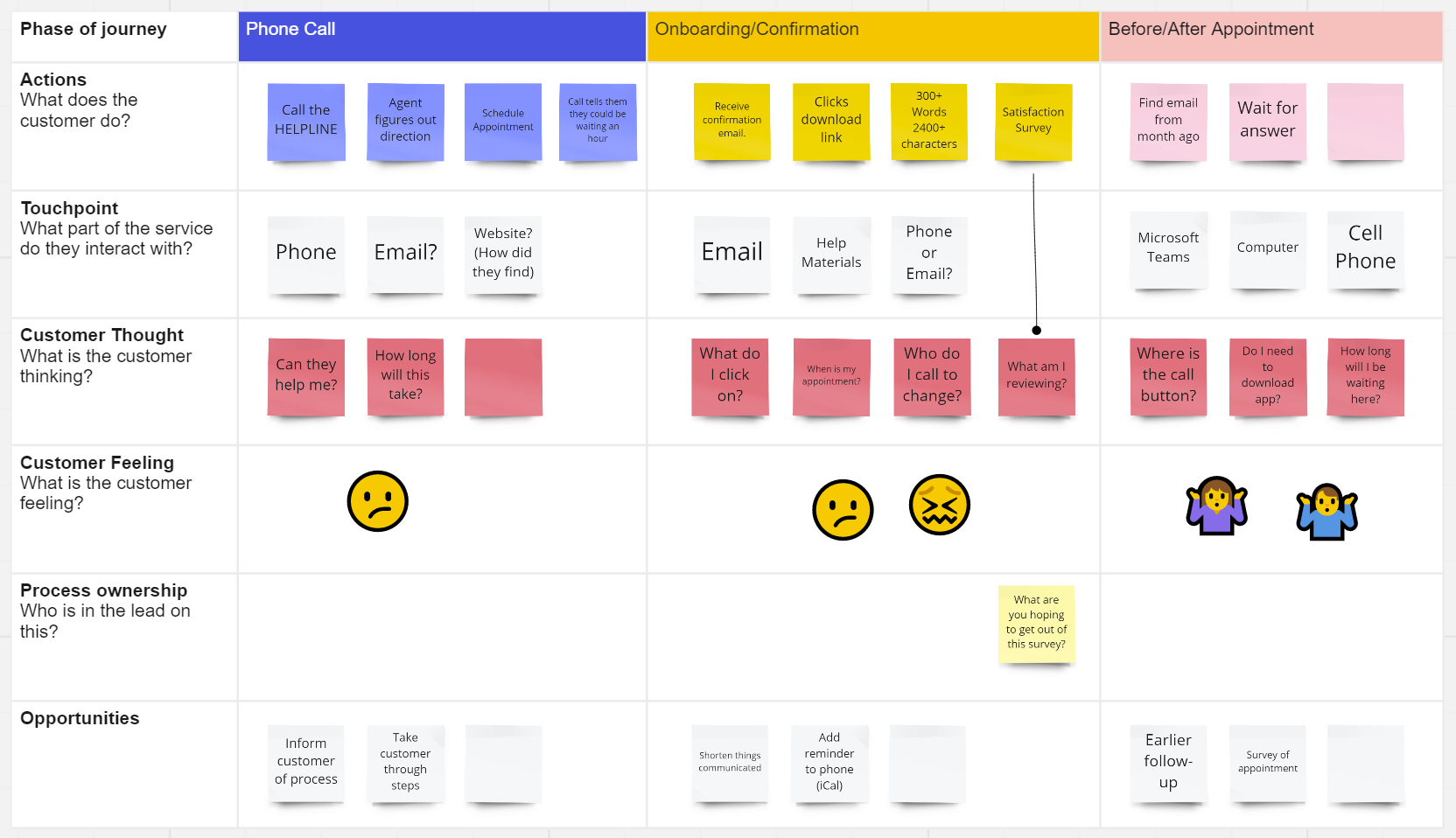
To visualize how clients find and interact with the service I created a Customer Journey Map.
I decided to map out the client’s journey in order to understand and visualize the client’s feelings and pain points. It also provides a bird’ eye view of the entire customer journey for the stakeholders.
Ideate
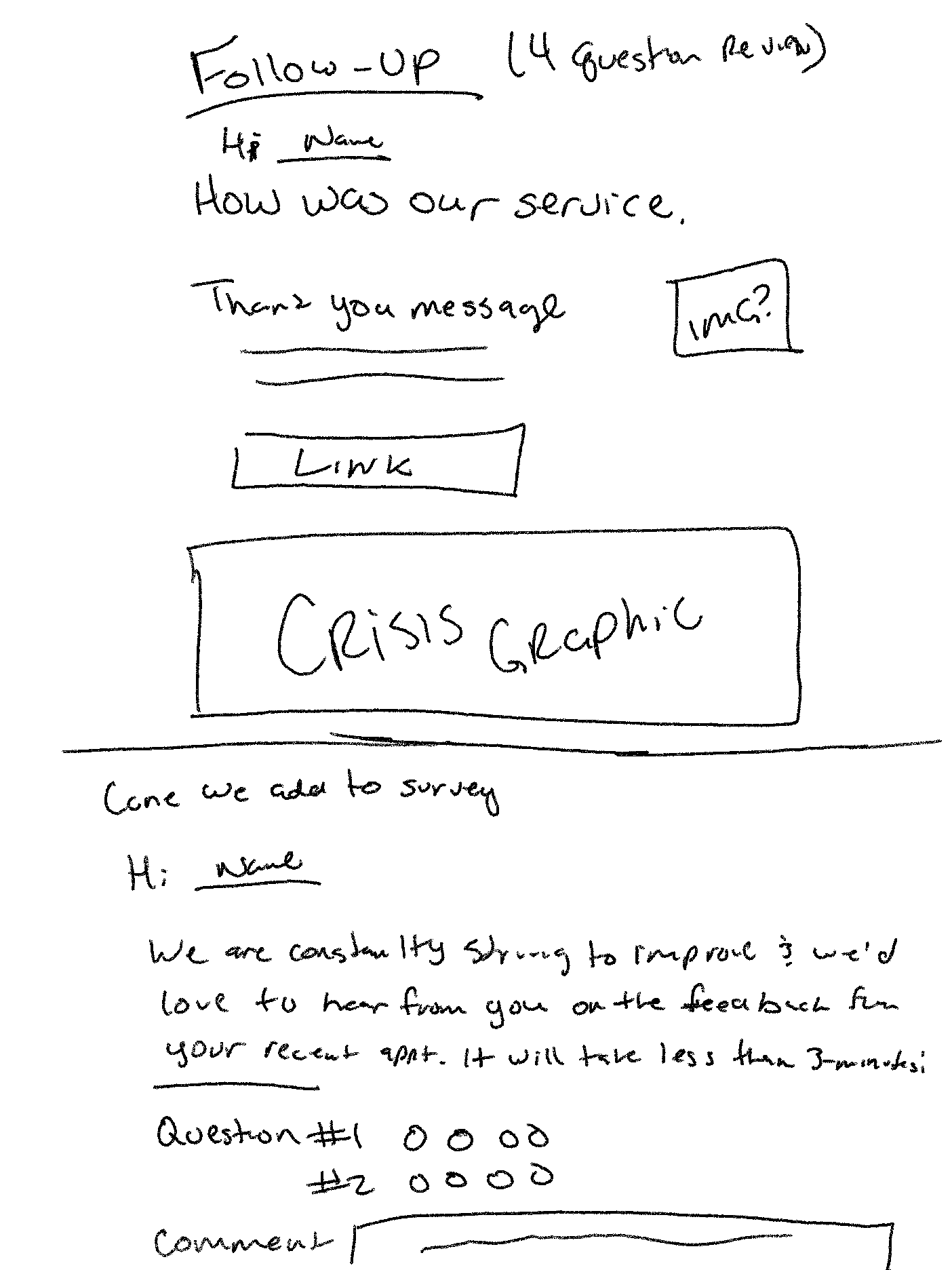
Initial Sketches
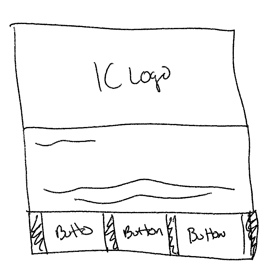
Before I start moving to tools for designing I started by stretching a few designs to see what I could come up with. I then did desktop research to see what other companies/agencies were sending to their clients when sending emails.
Prototype
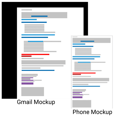
Color Visualization
I wanted to visualize the entire email without the words to get a more clear idea of the number of touchpoints the client was experiencing. After overlaying the email with color blocks (without text) gave me and the stakeholders more clear a better understanding of what the client was seeing when viewing our emails.
Color Decoder
- Grey = Text
- Dark Blue = Notice
- Lige Blue = H1 or Link
- Red = H1
- Purple = Link
Wireframe
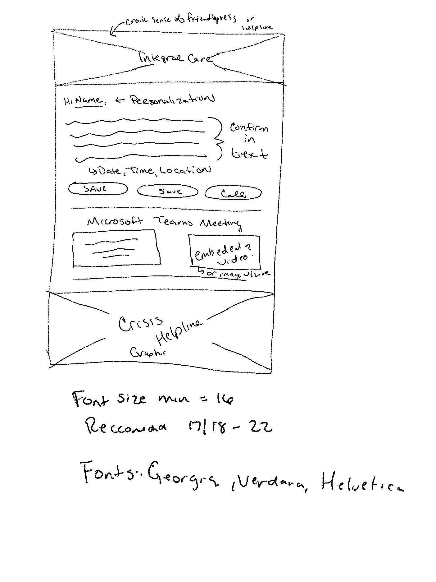
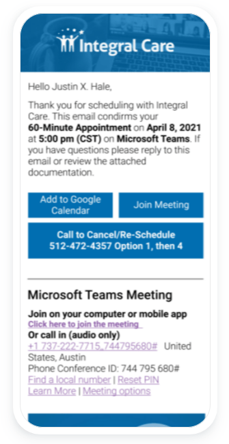
Based on my sketches I created high-fidelity mockups for both desktop and mobile.
The staff was not sure of how most people accessed their email in mind, so the design needed to be both mobile and desktop friendly.
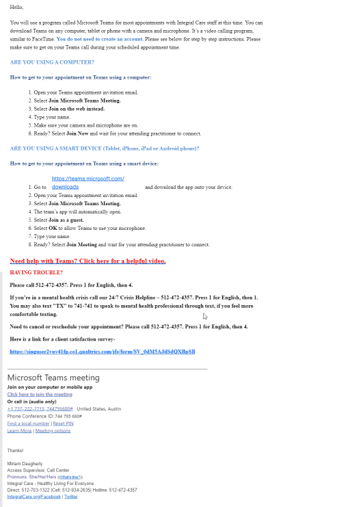
Required Components
- Microsoft teams information
- Help video
- Crisis Helpline phone number
My Recommended Additions
- Shorten email charter count from 2,220+ to under 600
- Add to calendar feature
- Call to re-schedule button
- Helpline Button that dials the prompts for the client (no need to press 1 for English anymore)
Solicit Opinion
After I completed the mockup I connected with the Senior Creative Designer asked a trusted co-worker about their option of the layout. Together we decided on some element and layout changes that saved space and highlighted some key areas. (You’ll see in the next section 🙂 )
Test & Iterate
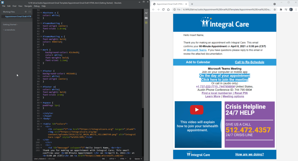
I decided to code
I had a relatively short amount of time to turn this project around, 4 weeks. Our MIS Department is typically packed with assignments, especially since there is only 1 application developer, so I decided to code the email (as best I could).
“This is great. This saves a lot of time!”
-Andrew, Applications Developer
We’re almost done.
Using my code, the application developer was able to take a project that would have taken at least one week and pushed it out in 30 minutes!
Using dynamic Microsoft Teams links and the client’s native email client for their appointment, allowed us to remove another button, giving the client choices to click on.
Project Learnings
What have you learned from this project?
Less is more, simplicity is strength, and reaffirmation of UX Laws like Jacobs, Miller, and Hicks.
When thinking back to this project I’m happy I tackled it the way I did. I could have taken a much easier route since my work as the Digital Media Specialist for the company doesn’t require me to think about the end-user, only visually design.
As of, June 2021, I’m still waiting on feedback about how the clients have responded to the email, but since there are no complaints so far, is it a success?
Not Featured
During this project, I also kept accessibility in mind.
- Font-Size
- Color Contrast
- Alt-Tag on images
Deliverables
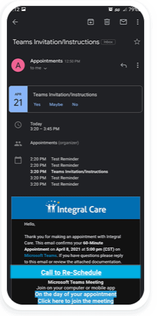
Before
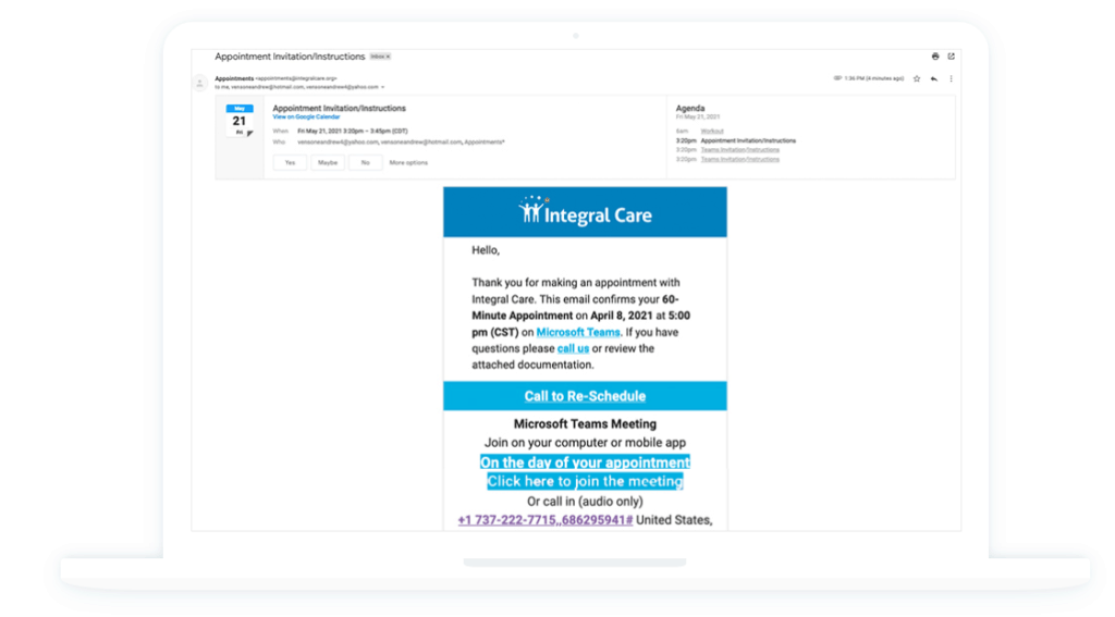
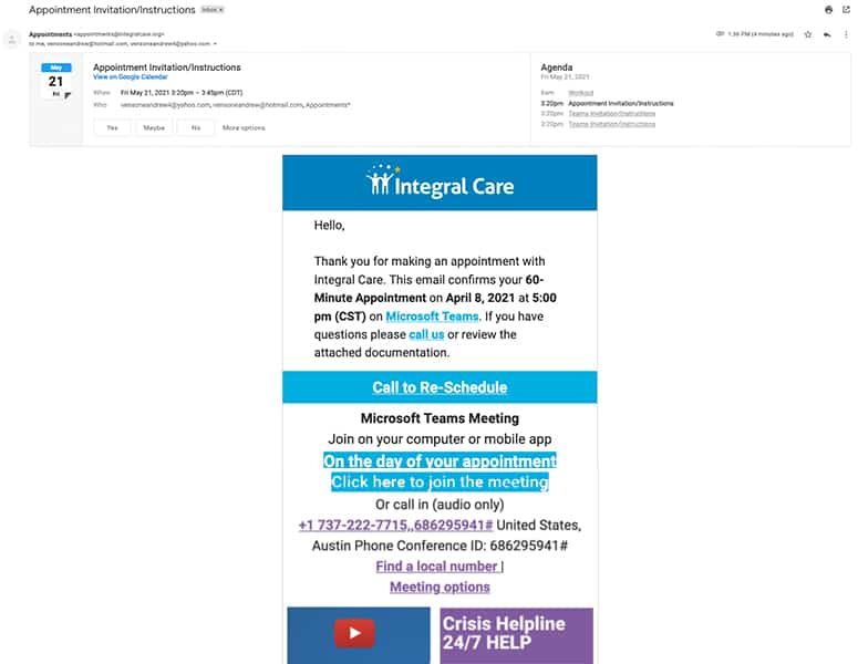
After
Dark Mode